Check how your website looks on a wide range of real device screen sizes to ensure a great mobile user experience.
Enter a URL above and click "Load Preview"
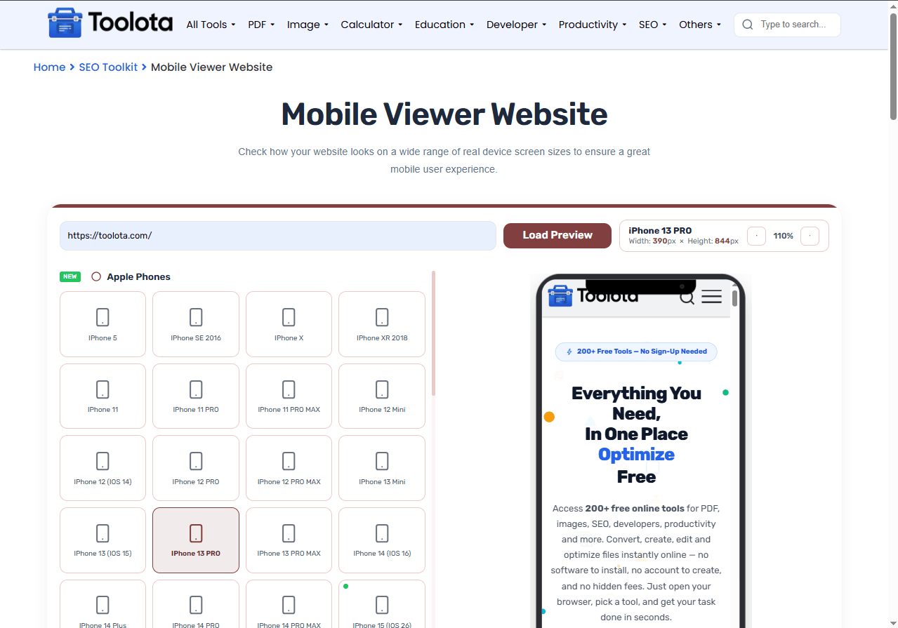
Simulating: iPhone 13 PRO
Mobile Viewer Website lets you preview any webpage inside accurate device frames before your visitors ever see it. Whether you’re a developer testing responsive layouts or a designer checking visual consistency, this tool loads your URL instantly and displays it across phones, tablets, laptops, and more. It makes testing responsive design quicker and more dependable by giving you a preview of your website on mobile devices without ever needing a real one. Select a device, type in your URL, and observe how your website behaves on actual screen sizes.
URL Input Field — Paste any website address to preview it instantly across all devices
Device Selection Grid — Choose from Apple phones, Android devices, tablets, laptops, and wearables
Live Preview Frame — See your site rendered inside accurate device mockups in real time
Zoom Controls — Zoom in and out to inspect fine details on any screen size
Realistic Device Chrome — Dynamic island, notch, punch-hole, and home button overlays for authentic previews
Device Information Panel — View exact width, height, and device name for every selection
Load Preview Button — One-click loading with Enter key support for fast testing
Frame Scroll Management — Clean preview display with automatic scaling and responsive wrapping

Type or paste the website address you want to test into the input field.

Browse through phone groups (Apple, Android, Tablets, Specials) and tap any device card.

Click "Load Preview" or press Enter on your keyboard to display the site.

Use the zoom buttons to magnify details or zoom out for a full overview.
“How do I check my site on different phones without actually owning them?” — Just use this mobile viewer website, pick any device from the list, and your site loads instantly in that phone’s exact screen dimensions.
Test your site across Apple and Android phones, tablets, laptops, wearables, and even kiosks — all from your browser.
Every device frame uses real screen dimensions with accurate chrome overlays so your preview matches real-world behavior.
This mobile viewer website runs entirely in your browser — no additional software, plugins, or app installations required.
No need to install emulators or connect physical phones. Enter a URL and preview within seconds.
Inspect every corner of your design with zoom controls that let you focus on any element, no matter how small.
Change font size and toggle word wrap to make the input area comfortable for any screen.
Use the zoom feature to inspect small UI elements — button text, icon sizes, and touch targets become clearer when you zoom in.
Start with the most popular devices — check iPhone and Samsung Galaxy models first since they cover the largest share of mobile visitors.
Switch between different device categories — a design that looks perfect on a phone might break on a tablet, so test both before publishing.
When you load your URL in this mobile viewer website, the tool renders your site inside a frame that matches exact device dimensions — not a generic browser resize. The chrome details matter too: a notch shifts top content, a home button affects bottom spacing, and tablet bezels change visual proportions. You catch overlapping text, cut-off buttons, or misaligned images before visitors do. The result? A design that works across every screen.
It’s a browser-based tool that loads any URL inside simulated device frames so you can preview how a site looks on different phones, tablets, and screens.
Yes — the tool is completely free and runs in your browser with no registration, downloads, or hidden charges.
You can preview on Apple phones (iPhone 5 to 17 Pro Max), Android devices (Samsung, Google Pixel, Xiaomi), tablets, laptops, smart TVs, kiosks, and wearables.
No. Everything runs in your desktop browser. You preview the mobile view without ever touching a physical phone.
The frames use exact screen dimensions for each device with realistic chrome details like notches, dynamic islands, and punch-hole cameras for authentic visual testing.
Yes — the zoom buttons let you scale the preview up or down so you can inspect any part of the page closely.
Toolota is your all-in-one online tools platform. Fast, simple, and free utilities designed to make everyday digital tasks easier and smarter.