Paste your X and Y data points to instantly generate interactive Scatter or Line charts.
Enter data to view chart
In today’s data-driven environment, the ability to quickly visualize information is not just an advantage—it’s a necessity. Whether you’re a student verifying lab results, a researcher spotting trends, or a professional preparing a quick report, waiting for complex software to load or worrying about data privacy can disrupt your workflow. This is where a specialized tool like the Client-Side Data Plotter becomes indispensable. It is a sophisticated, yet remarkably simple, web-based application designed to transform raw numerical data into clear, interactive charts directly within your browser. The core principle of this Client-Side Data Plotter is that all processing happens locally on your computer; your data never travels over the internet to a remote server.
At Toolota, we are committed to creating utility-first web tools that solve real problems without friction. Our Client-Side Data Plotter embodies this philosophy. We built it because we recognized a gap: many free online charting tools require data uploads, while powerful desktop applications are often overkill for quick, simple visualizations. Our tool sits perfectly in the middle. Toolota’s reputation is built on reliability and user-centric design. This Client-Side Data Plotter features a clean, intuitive interface that guides you from data entry to visualization in seconds, without any confusing menus or technical jargon. It’s engineered for productivity, offering immediate visual feedback.
This section provides a precise, accurate walkthrough of the tool based solely on its actual HTML interface and functionality. Follow these steps to create your chart.
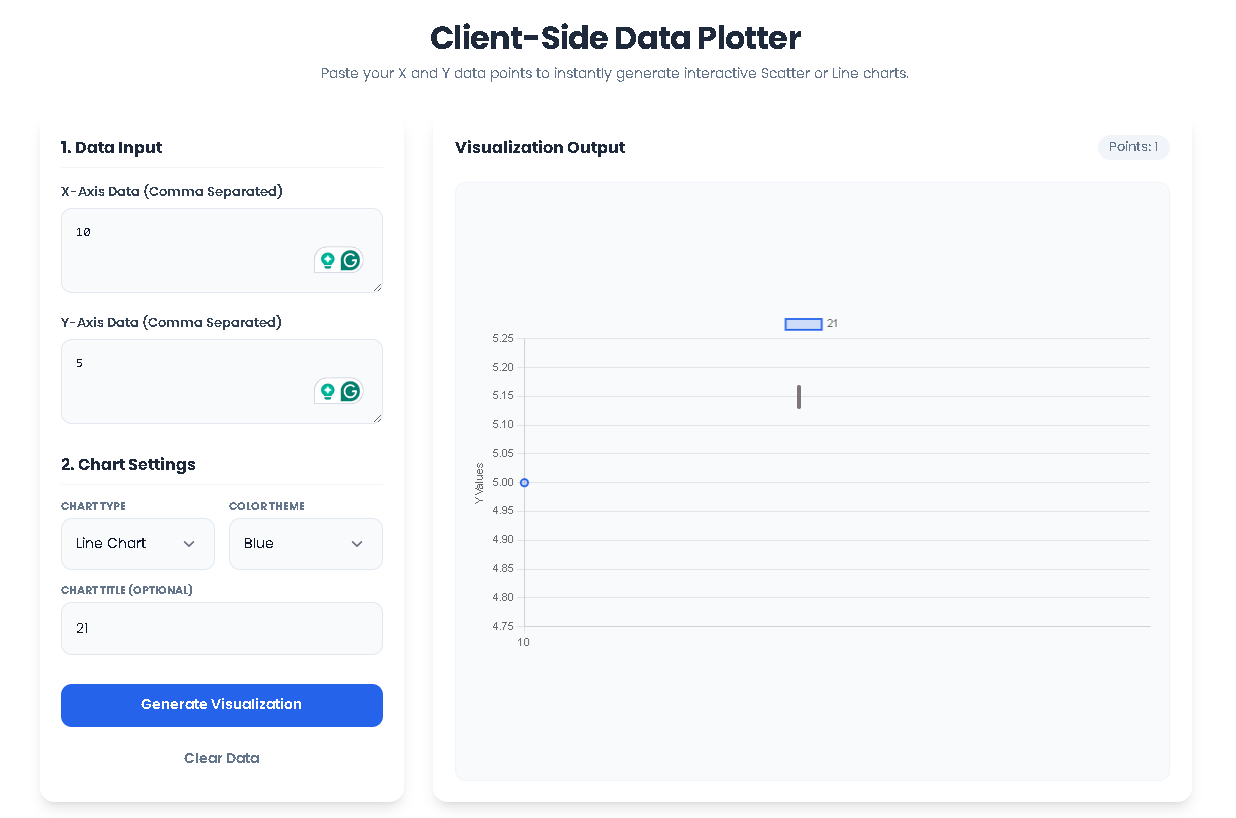
Step 1: Input Your X and Y Data
Locate the “Data Input” section in the left-hand control panel. You will see two textarea fields labeled “X-Axis Data” and “Y-Axis Data”. Click into the “X-Axis Data” box and enter your first set of numerical values, separated by commas (e.g., 1, 2, 3, 4, 5). In the “Y-Axis Data” box directly below, enter your corresponding values in the same order (e.g., 10, 15, 13, 20, 25). The tool automatically trims spaces and filters out non-numeric entries. Ensure both lists have an equal number of data points.
Step 2: Configure Your Chart Settings
In the “Chart Settings” section directly below, customize your visualization. First, use the “Chart Type” dropdown menu to select your preferred format: “Line Chart” for connected trends, “Scatter Plot” for individual data points, or “Bar Chart” for categorical comparisons. Next, use the “Color Theme” dropdown to choose a color scheme (Blue, Red, Green, Purple) for your chart elements. Finally, you can type a custom title for your chart in the optional “Chart Title” field (e.g., “Sales Growth Q1”).
Step 3: Generate the Visualization
With your data entered and settings configured, click the blue “Generate Visualization” button. The tool now executes its core function as a Client-Side Data Plotter. It parses your input strings, validates that the X and Y arrays match in length, and performs all calculations locally. If successful, the empty-state graphic on the right disappears, replaced by an interactive Chart.js canvas. A small stats summary badge will appear, showing the count of data points plotted.
Step 4: Interact with and Reset Your Chart
Your chart is now live. You can hover over data points (in scatter or line charts) or bars to see precise values. The chart is fully responsive. To start over, simply click the “Clear Data” button. This will instantly empty all input fields, destroy the current chart instance, and restore the initial empty state, allowing you to paste a new dataset and begin again.
The Client-Side Data Plotter from Toolota delivers significant advantages that enhance your data analysis workflow:
Unmatched Speed and Efficiency: There is no software to launch and no files to upload. Visualization is literally instantaneous—click the button, and the chart renders. This streamlines iterative analysis, allowing you to tweak data and see changes in real-time.
Guaranteed Data Privacy and Security: As a true Client-Side Data Plotter, it operates entirely within your browser’s sandbox. Your confidential research, financial figures, or proprietary datasets never leave your machine. This is a critical benefit over cloud-based alternatives.
No-Cost Accessibility: The tool is completely free to use, with no hidden fees, account requirements, or usage limits. It democratizes data visualization, making it accessible to anyone with a web browser.
Clean and Intuitive User Experience: The interface is designed with clarity in mind. Labeled fields, logical grouping, and visual feedback (like the styled input focuses) make the tool approachable for beginners while remaining efficient for experts.
Professional Output Quality: Leveraging the robust Chart.js library, the generated charts are clean, modern, and interactive. They are suitable for presentations, reports, or for capturing insights for further analysis.
Convenience of Copy & Use: The chart is rendered directly on the page. You can use your browser’s screenshot functionality to capture it, or, if needed for integration, access the underlying Chart.js instance via browser developer tools for advanced users.
To ensure optimal results and proper use of the Client-Side Data Plotter, please keep the following conditions in mind:
Output Quality Depends on Input: The accuracy and usefulness of the chart are directly tied to the quality and correctness of the numerical data you provide. Always double-check your comma-separated values.
Data Matching is Essential: The tool requires an equal number of X and Y values. A clear error message will alert you to a mismatch, preventing skewed or meaningless charts.
Browser-Based Limitation: As a client-side application, it is designed for in-browser use. Charts are not automatically saved as image files; you must manually screenshot or export them.
Intended for Legal Use: This tool is provided for legitimate data analysis and educational purposes. Toolota does not condone its use for manipulating or visualizing data for fraudulent, harmful, or illegal activities.
Fair Use: While free, we rely on responsible use. Please do not attempt to overload the tool with automated requests or excessively large datasets that may impact browser performance.
Client-Side” means all data processing and chart generation happens locally on your device (the client), within your web browser. Unlike server-side tools, your data is not uploaded to any external server, ensuring complete privacy and faster performance. This is the defining feature of our Client-Side Data Plotter.
The tool accepts simple, comma-separated numerical values. You can copy-paste data from spreadsheet cells (like Excel or Google Sheets), plain text files, or type them directly. It intelligently ignores extra spaces and line breaks, parsing only valid numbers for plotting.
There is no hard-coded limit enforced by the tool itself. However, practical limits are imposed by your browser’s memory and performance. For the best experience with this Client-Side Data Plotter, we recommend using it for small to medium-sized datasets (up to several hundred points). Extremely large datasets may cause the browser to become unresponsive.
The tool currently focuses on instant, interactive visualization within the browser. To save your chart, you can use your operating system’s screenshot function (like Snipping Tool on Windows or Cmd+Shift+4 on Mac) to capture the chart canvas. This method provides a quick and high-quality image for use in documents or presentations.
Toolota – 350+ Free Online Tools for PDF, AI, Design & More. Use any place, any time with out paying and signup needed.